A local brand from New Delhi, India focused on creating fresh cold pressed juices. The idea started as a cloud kitchen as a B2B service but eventually became a Health Cafe in the centre of Delhi.
client
Prashant Kataria
year
2020
timeframe
4 Weeks
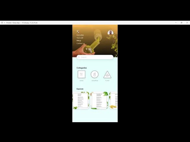
Branding
Web
Retail Design
My Role
I worked on this project as a Freelance Designer. Creating the whole brand frokm ground up with the owner. From Designer the Logo, CI and mood for the brand to co-creating Kiok and a full fledged running cafe. I stepped up to very challenge with my partner designer Avesh Gaur.
Impact
We were able to launch the brand within a span of 6 months from its conception. It was a rigourous process including user testing and market analysis and full of A/B testing but the project grew organically with consistent efforts and turned into a successful venture that ran for almost 5 years.
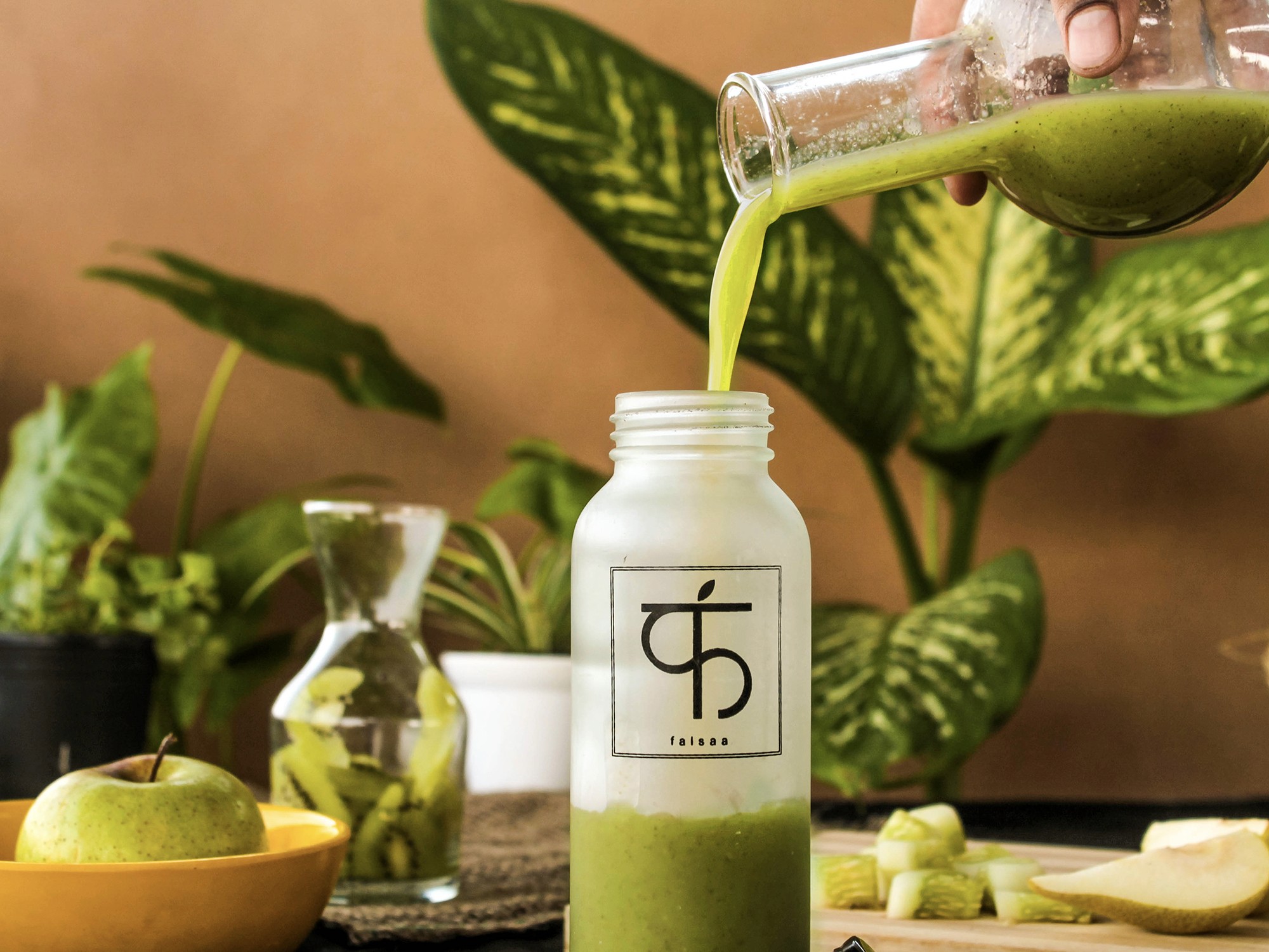
The logo design is inspired the letter "F" written in devanagari font. As the first letter of the brand it is derived by intersecting the most basic gemetric shapes. Symbolising the power of simplicity and purity. The lable design shown below highlights the main vitamin present in the certain bottle promoting contious comsumption.

Working with young professional photographers we aimed to create a strong presence of the brand, these visuals were used for sevral online and offline campaigns for the brand. We a clear vision - conscious, culturally rooted movement toward clean consumption.


Realising the branding in the world was fairly simple. After we created the thought through guidlines for ourselves and the owner.