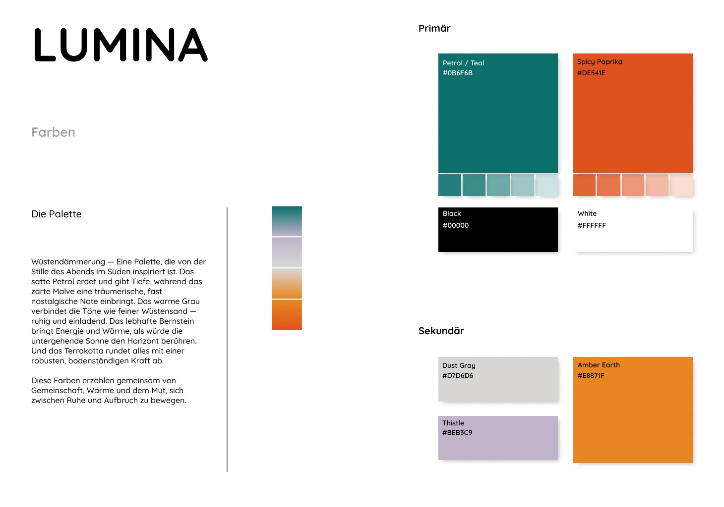
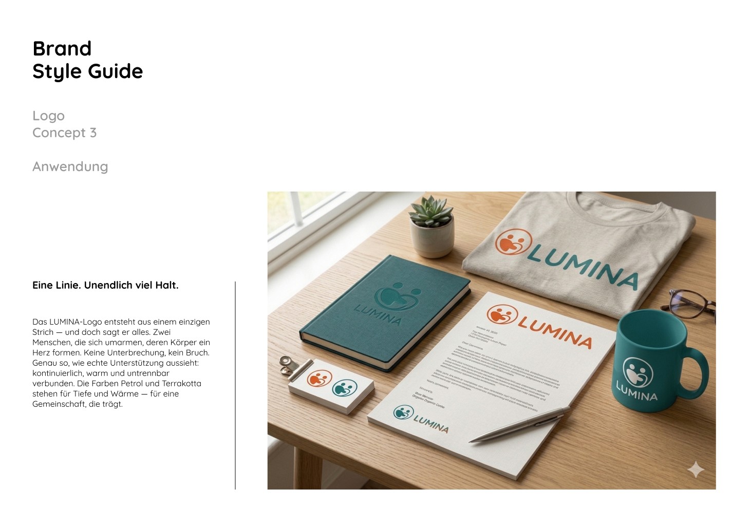
LUMINA is a brand identity project built around one idea: community as warmth, not hierarchy. The name plays on light — not light that shines down from above, but light that comes from the middle of people gathered together. The identity centers on a "Wüstendämmerung" (desert dusk) color palette — deep petrol teal grounding the mark, warm terracotta and amber bringing energy, and dusty grays and soft thistle tying it all together — paired with Quicksand, a rounded geometric typeface that echoes the logo's soft, circular forms. The full system covers logo, color, typography, and brand application across stationery, apparel, and merchandise.
client
Freelance
year
'26
timeframe
1 week
Graphic Design
Branding
Logo

My Role
Art direction and brand design, end to end. I developed three distinct logo concepts for the client to choose between — each built on the same core motif of two figures forming a heart, but explored through different construction logics: overlapping circular forms, a rotational "blooming" pattern, and a single unbroken contour line. For each concept I built out the full identity system: color palette rationale, typography pairing, logo variations (icon, wordmark, lockups), and realistic mockup applications on notebooks, business cards, stationery, mugs, and apparel to show the brand in context.
Impact
The three-concept approach gave the client a clear, structured way to choose a direction rather than reacting to a single fixed idea — each concept told the "community" story through a different visual logic, from literal (two figures embracing) to abstract (a blooming flower form) to minimal (one continuous line). The mockup applications made the brand tangible early, helping stakeholders see how the mark would actually live on real touchpoints before committing to a final direction.